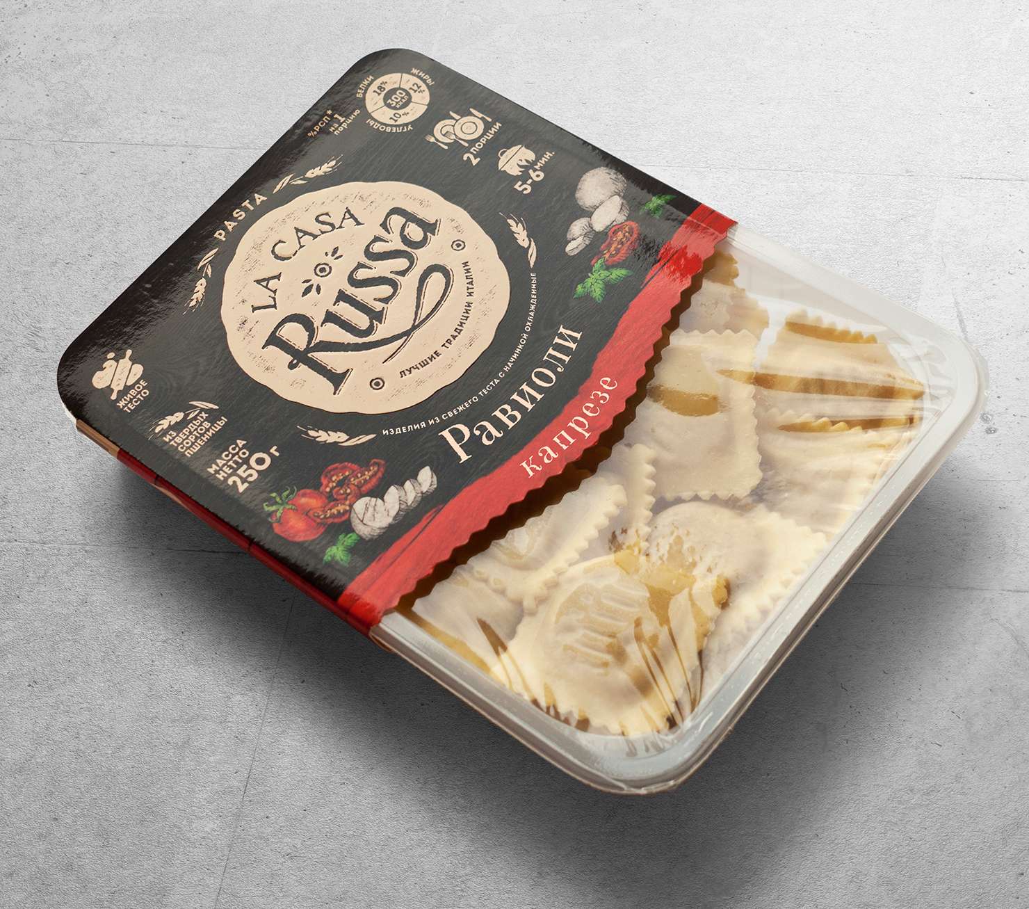
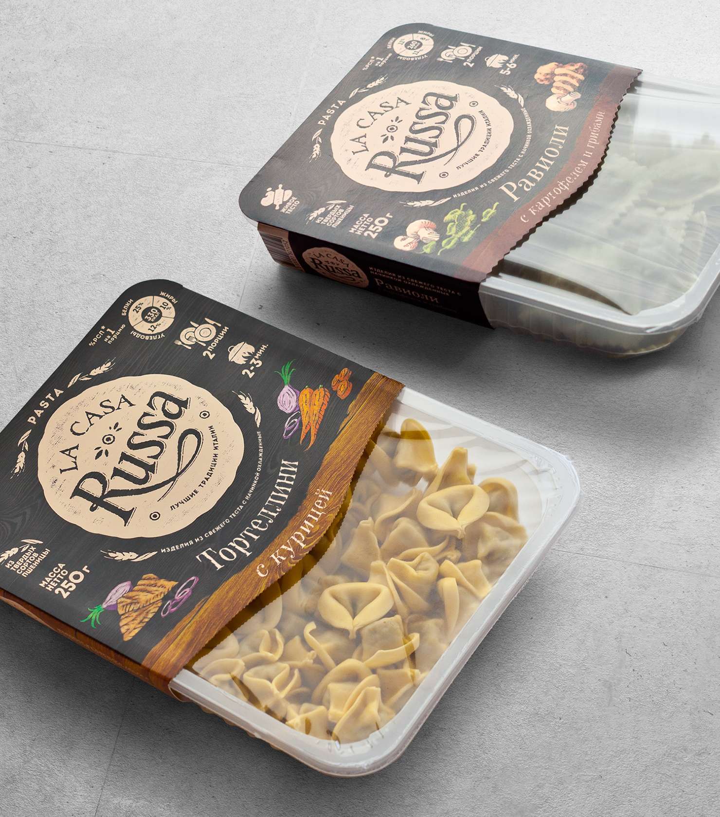
La Casa Russa.
After rebranding the La Pasta Fresca line, our client discovered that competitors occupied a neighboring niche of environmentally friendly products. So La Casa Russa was born – the sister of the main line La Pasta Fresca. A logo of washed our style, plain stylish drawings instead of photos determined the emphasis on home cooking and guaranteed the commercial success of the brand.
Ask questions.
They matter more than answers.
With every project, the studio undergoes a complicated course from sketches to the consumer, while every design evolves and eliminates the excess. The best design is born through the synergy of ideas. It relies on the experience of both the client and the designer.
