Publication of
British Virgin Islands.
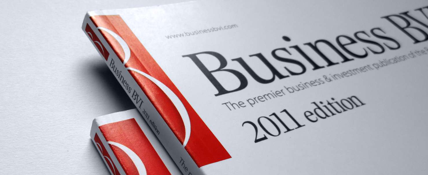
We got a task to redesign a letterhead for the premier business magazine of strongest economy of the Caribbeans, The British Virgin Islands.
Discovered
Actual font of the logo, Garamond is frequently used for body text, because of the difference of characters that is better for small texts. By choosing a correct typography, the letterhead acquires a really professional look.
Found
Lighter font allows to enlarge characters, so the headline looks bigger. And at the same time it “breaths”, providing more space for cover.
Done
Straight strokes and square serifs makes characters more united, that is way better for headline. All that makes the logo look up to date.
Ask questions.
They matter more than answers.
With every project, the studio undergoes a complicated course from sketches to the consumer, while every design evolves and eliminates the excess. The best design is born through the synergy of ideas. It relies on the experience of both the client and the designer.
